

Getting Animated! With React-Spring #2: The useSpring Hook

Welcome to part two of our series on animating react with React-Spring! In the first article we took a quick look at what React-Spring is, what makes it awesome, and took a peek at what the api has to offer. Today we're going to take a bit deeper of a dive into the first hook the api offers, useSpring.
If you're looking for a different section of this series, please refer here for the full list
What We're Building
The goal of this section will be to use the useSpring hook to take a profile card:
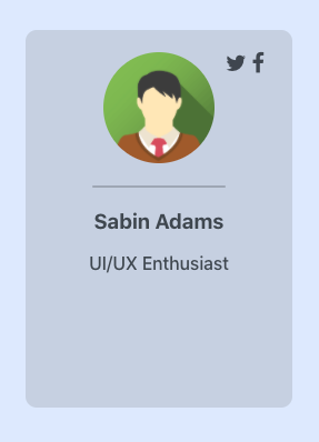
and build out some loading and hover animations to give it a little more personality 😁

useSpring
Basic Use
The first hook we'll look at is called useSpring. In essence, this hook simply animates a data value from point a to point b. In its most basic form, a spring will look something like this:
// Make sure to import the hook and the animated privitive
import { useSpring, animated } from 'react-spring'

const props = useSpring({ to: { opacity: 1 } })
// ... or the shorthand version of the above
const props = useSpring({ opacity: 1 })
Here's what this is doing:
We are passing in to the hook an object defining what values we want animated and what the key names of those values are. In our case, we are saying we want to animate a value named opacity to a value of 1. Let's apply this animation to a div element:
import React from 'react'
import { useSpring, animated } from 'react-spring'

function AnimatedDiv() {
    const props = useSpring({opacity: 1})

    return (
        <animated.div style={props}>
            <p>I'm some text</p>
        </animated.div>
    )
}

export default AnimatedDiv
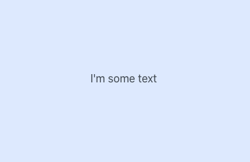
You may notice that nothing really seems to be getting animated here. It has an opacity of 1 like we asked, but why wouldn't it? That's the default in a browser unless specifically styled otherwise. In order to see the animation in action let's add a from definition where we can define the initial setting of values we are animating.
const props = useSpring({opacity: 1, from: { opacity: 0 } })
Now you should see your text fade in.

The important thing to remember here is that these DO NOT have to be styles. They key names are arbitrary and can be anything except for a few reserved keywords in the react-spring api.
For example, if we wanted to animate a value from 2 to 10 to display inside of a <p> tag, we could write the following:
import React from 'react'
import { useSpring, animated } from 'react-spring'

function AnimatedParagraph() {
    const props = useSpring({ number: 10, from: { number: 2 } })
    return <animated.p>{ props.number }</animated.p>
}

export default AnimatedParagraph

The examples above are very basic and use the default settings of the useSpring hook. Let's make a couple of changes to enhance the experience a bit:
- The animation is super fast, let's slow it down
- The values are long-trailing decimals... we'll use
interpolationto round those up
Configuration
useSpring has a bunch of configuration options that allow you to either change the duration of the animation, or adjust the physics of the spring-like calculation of values. Note that this is an either-or option. If you use the duration configuration option, you forfeit the physics aspect of calculating the values. In some cases this is fine and won't make much of a difference.
Let's use the duration configuration option to define how long we want our animation to take. To do this we'll add the config key.
import React from 'react'
import { useSpring, animated } from 'react-spring'

function AnimatedParagraph() {
    const props = useSpring({
        number: 10,
        from: { number: 2 },
        config: { duration: 2000 }
    })
    return <animated.p>{ props.number }</animated.p>
}

export default AnimatedParagraph

Here, we've configured our animation to take 2 seconds (2000 milliseconds). Any other configuration options available in the common API also go in this config object. Now let's use interpolation to round the value and get rid of those pesky decimals.
Interpolation
Every animated value has attached to it a function named interpolate, which allows you to format or perform actions on the value before using it in the view. This function can either take in an object defining the interpolation, or a function with the value as its parameter. We'll use the function in our scenario to round the number.
import React from 'react'
import { useSpring, animated } from 'react-spring'

function AnimatedParagraph() {
    const props = useSpring({ number: 10, from: { number: 2 }, config: { duration: 2000 }})
    return <animated.p>{ props.number.interpolate( num => Math.round(num) ) }</animated.p>
}

export default AnimatedParagraph

Great! Our simple animation is looking good 👍 These are just a few of the many options from react-spring's common-api that all of its hooks are build upon. Over the course of this series we will take a look at most of these options.
Putting useSpring To Use
Now that we know a little bit about the useSpring hook, let's create an animated profile card!

This animation will be our first goal. Upon rendering the component, we want to scale the card up to full size. Note how the animation over-shoots the size a bit and bounces back to it's full scale. This is because of the spring-like nature of react-spring. In this animation we will make use of the tension, mass, and velocity configuration options to define how we want our spring to behave.
First off, let's see what our un-animated component looks like. I won't be digging into the specific styling of components in this series so much, as our focus will just be the animations.
import React from 'react'
import './ProfileCard.scss'

function ProfileCard() {

    return (
        <div className="cardWrapper">
            <div className="profileCard">
                <div className="iconHolder">
                    <a className="fa fa-twitter"></a>
                    <a className="fa fa-facebook"></a>
                </div>
                <img src="https://www.w3schools.com/w3images/avatar2.png"/>
                <div className="divider"></div>
                <div className="details">
                    <h3 className="name">Sabin Adams</h3>
                    <p className="description">UI/UX Enthusiast</p>
                </div>
            </div>
        </div>
    )
}

export default ProfileCard

So where do we start? Honestly, to achieve our goal is quite simple. Here's what we need to think about in this scenario:
- We need to use the
animatedprimitive so we can use animated values in our view - We will be animating the scale from some smaller size to its full-size. To do this we will use the
transformcss property - There is also a
box-shadowthat gets adjusted, so our spring will need to adjust that as well (Yes, springs can handle multiple values!)
Applying animated
So let's take this step by step. First thing's first, we want to support animated values! In our return, we'll apply animated to the div containing the profile card.
return (
    <animated.div className="cardWrapper">
        // ... Profile card markup
    </animated.div>
)
With that in place, we're ready to set up a spring and scale the card!
Using useSpring to scale the card
As we say above, setting up a spring with a from and to value is easy. Springs handle tons of different value types. Some of these include any value available to the transform css property. We will be using the scale property. You can read more about that here if you'd like.
const props = useSpring({
    transform: `scale(1)`,
    from: { transform: `scale(0.5)`}
})
As you've probably already figured out, this will start our profile card off at half its normal scale and animate it up to full-size. Now all we need to do is apply the animated values to the style of the animated div:
import React from 'react'
import './ProfileCard.scss'
import { useSpring, animated } from 'react-spring'

function ProfileCard() {

    const props = useSpring({
        transform: `scale(1)`,
        from: { transform: `scale(0.5)`},
    })

    return (
        <animated.div className="cardWrapper" style={props}>
            // ... Profile card markup
        </animated.div>
    )
}

export default ProfileCard
Let's see the result:
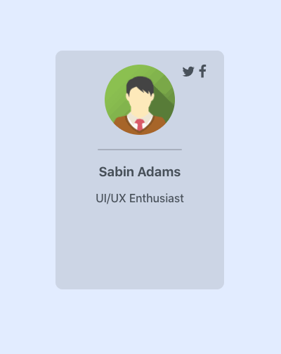
Pretty cool, right? BUT it could be better! This animation works great but looks pretty static. I like my animations a bit bouncier and natural. Fortunately, the springy nature of react-spring allows us to accomplish that using configurations. Here are the configurations we will use:
const props = useSpring({
    transform: `scale(1)`,
    from: { transform: `scale(0.5)`},
    config: {
        tension: 400,    // How much tension is on the spring
        mass: 2,         // The mass of the spring
        velocity: 5      // The initial speed of the movement
    }
})
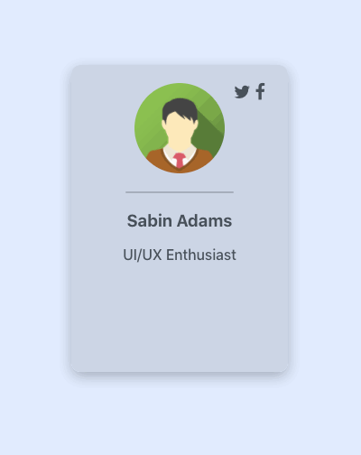
With these configurations, we will have a fairly tense spring. Think of a spring that is being stretched and is ready to bounce back. We've also added mass to it so that the weight of the spring will slow down the movement a bit and pull against the spring once it reaches the full-size. This will result in it overshooting a little, but slowly bouncing back to the final value. Imagine when you drop one side of a spring and it bounces up and down until it comes to a smooth stop. Finally, our velocity we added just makes the animation a bit more snappy initially. It doesn't have to build so much energy initially, it starts off with some quick movement. Here's the result:

Awesome! That looks way more natural and customized. Our final piece here to give the card a more realistic look is to add that shadow.
Adding a box-shadow adjustment to the spring
Adding the shadow is super easy now that we already have our spring defined. We simply need to add the to and from values of the shadow and react-spring can handle deciding how to update the shadow.
const props = useSpring({
    transform: `scale(1)`,
    boxShadow: `0px 5px 15px 0px rgba(0, 0, 0, 0.30)`,
    from: {
        transform: `scale(0.5)`,
        boxShadow: `0px 0px 0px 0px rgba(0, 0, 0, 0.30)`
    },
    config: {
        tension: 400,
        mass: 2,
        velocity: 5
    }
})

Triggering Animations On Interactions
The profile card is looking awesome so far! Currently, upon rendering the card is animated to bounce into view, but that's about it. Let's spice it up a bit more. When hovering over the card, I'd like it to lift off of the page a bit. To create this effect, we'll do the following when hovering:
- Scale the card up a bit
- Adjust the shadow so it looks like the card is higher off the page
In order to achieve this on-hover effect, we will need to use the useSpring hook in a different way which provides us access to some helper functions react-spring provides. Here's what that will look like:
const [ props, set, stop ] = useSpring(() => ({
    transform: `scale(1)`,
    boxShadow: `0px 5px 15px 0px rgba(0, 0, 0, 0.30)`,
    from: {
        transform: `scale(0.5)`,
        boxShadow: `0px 5px 15px 0px rgba(0, 0, 0, 0.30)`
    },
    config: {
        tension: 400,
        mass: 2,
        velocity: 5
     }
}))
useSpring allows us to pass in a function that returns the configuration we desire for the spring rather than an object. This is super useful for many reasons, but the reason it is useful to us here is that it returns an array of items for us to use.
- props - The same props object the hook returns when using an object instead of a function
- set() - This allows us to update the spring without causing a re-render of our component
- stop() - Stops the animation
In our hover animation, we will need to use the props object and set() function.
Animating onMouseEnter and onMouseLeave
To accomplish this, we will need to use our set() function when the mouse hovers over the element and when the mouse leaves the element. The set() function acts just like useSpring in that you pass it an object or a function that returns an object. This object contains the spring configuration you would like to update to. For example, consider the following code:
const [props, set] = useSpring(() => ({
    height: 10,
    from: { height: 0 },
    config: { duration: 1000 }
}))

set({height: 20})
This will set up a spring that animates a height value from 0 to 10. Then afterwards, the animation is updated, however, to a height of 20. It will, because of this, animate the height to 20. What we are wanting is to trigger this update on an interaction rather than before the component is loaded. To do so, we will leverage the onMouseEnter and onMouseLeave props.
// Set up our spring
const [props, set] = useSpring(() => ({
    transform: `scale(1)`,
    boxShadow: `0px 5px 15px 0px rgba(0, 0, 0, 0.30)`,
    from: {
        transform: `scale(0.5)`,
        boxShadow: `0px 0px 0px 0px rgba(0, 0, 0, 0.30)`
    },
    config: { tension: 400, mass: 2, velocity: 5 }
}))

// Updated value generator
const updateHover = hovering => ({
    transform: `scale(${ hovering ? 1.1 : 1})`,
    boxShadow: `0px ${hovering ? '10px 20px' : '5px 15px'} 0px rgba(0, 0, 0, 0.30)`
})

return (
    <animated.div className="cardWrapper" style={props}
        onMouseEnter={() => set(updateHover(true))}
        onMouseLeave={() => set(updateHover(false))}
    >
        // ... Profile card markup
    </animated.div>
)
Whoa! What's going on here? It's actually a lot simpler than it may seem. When the onMouseEnter and onMouseLeave events are fired, we are running the set() function. It's value is a function we defined above that, based on whether or not we are hovering, returns an object containing the newly configured values we would like to animate to. Here's the result:
Pretty awesome, right? And the cool part about that set() function is the fact that it does not require a re-render of the component. Because of that level of efficiency, set() is the preferred way to do animations that happen quickly and often.
Here's a look at the entire component!
import React from 'react'
import './ProfileCard.scss'
import { useSpring, animated } from 'react-spring'

function ProfileCard() {
    const [props, set] = useSpring(() => ({
        transform: `scale(1)`,
        boxShadow: `0px 5px 15px 0px rgba(0, 0, 0, 0.30)`,
        from: {
            transform: `scale(0.5)`,
            boxShadow: `0px 0px 0px 0px rgba(0, 0, 0, 0.30)`
        },
        config: { tension: 400, mass: 2, velocity: 5 }
    }))

    const updateHover = hovering => ({
        transform: `scale(${ hovering ? 1.1 : 1})`,
        boxShadow: `0px ${hovering ? '10px 20px' : '5px 15px'} 0px rgba(0, 0, 0, 0.30)`
    })

return (
    <animated.div className="cardWrapper" style={props}
        onMouseEnter={() => set(updateHover(true))}
        onMouseLeave={() => set(updateHover(false))}
    >
        <div className="profileCard">
            <div className="iconHolder">
                <a className="fa fa-twitter"></a>
                <a className="fa fa-facebook"></a>
            </div>
            <img src="https://www.w3schools.com/w3images/avatar2.png"/>
            <div className="divider"></div>
            <div className="details">
                <h3 className="name">Sabin Adams</h3>
                <p className="description">UI/UX Enthusiast</p>
            </div>
        </div>
    </animated.div>
)
}

export default ProfileCard
Conclusion
useSpring is an awesome tool with so many different configurations and options. As you saw above, creating animations both simple and complex is fairly simple, and the extent of what the hook can do goes beyond what was covered here. I recommend reading the docs on this hook to see what else it offers. Some specific features being its ability to script and chain different animations together in one spring.
I hope you enjoyed jumping in and animating our profile card! In our next session, we will look at the useSprings hook and use that to generate a list of profile cards with individual configurations.
Thanks for the read, and happy animating!
The code for this section can be found on github


